Sculpt with Blanca
Sculpt with Blanca is run by the incredible Blanca Sobhan. Blanca provides personal barre and pilates training in the Bay Area for all levels of fitness and experience. Her mission is to provide nourishing, empowering movement for every type of body.
Deliverables:
Custom Logo Design
Alternative Logo Design
Favicon Design
Color Palette Development
Font Pairings
Branding Style Guide
Custom Icons
Website Content Strategy
Custom Website Graphics and Assets
Squarespace Web Design
Blanca was starting from scratch and was looking for my help to establish a consistent brand identity and web presence for her new business. We hit the ground running with her branding, and began to create a foundation for the visual aesthetic that we would be moving forward with. We wanted to go for a very warm, simple, inclusive, and natural feeling brand since it was important for us to capture the calming and community-based approach she takes with her training. I was inspired by the word “sculpt” to craft a brand identity that was full of soft lines, flowing patterns, and balanced earth tones.
The logo consists of a modern and friendly slab serif font with quirky, rounded elements. We paired this with a playful script font that mirrors the style of the line art favicon inspired by the classic teaser pose in pilates. One of my favorite parts of this project though was hand-drawing the abstract icon style that symbolized Blanca’s four primary offerings: mat pilates, reformer pilates, barre, and pilates for osteoporosis. They are full of the soft gentle curves and imperfect shapes to give the brand its warm and welcoming feel.
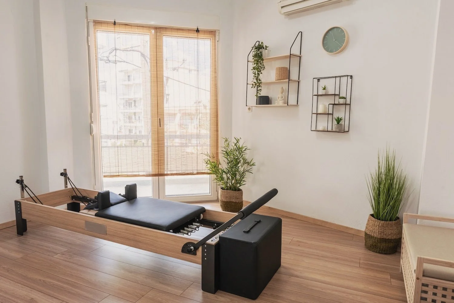
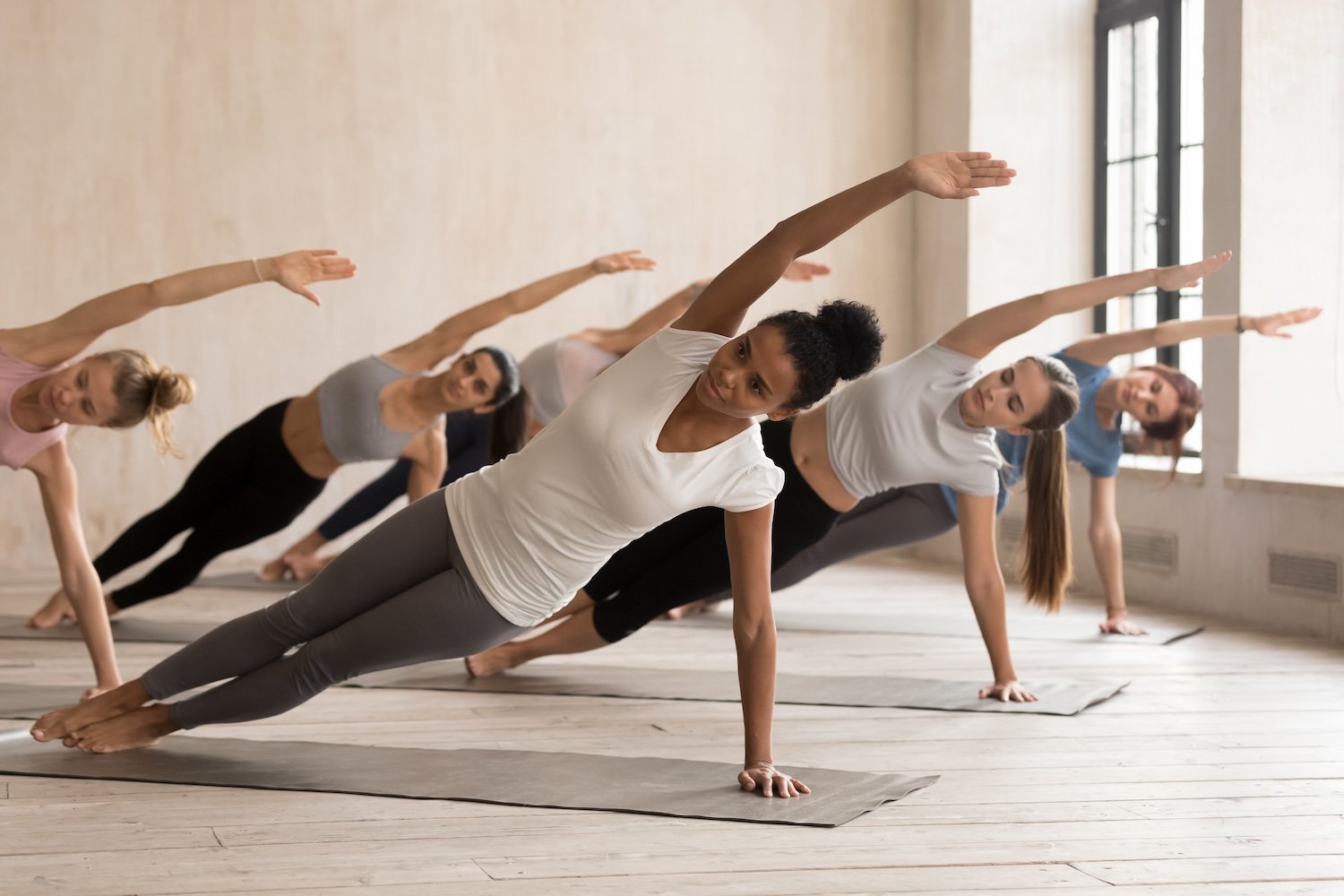
The color palette for the brand also feels warm and clean with the earthy mint, sage, clay, white, and linen tones. And to round out the brand, we made sure to establish brand guidelines and elements that included lots of open space, minimalistic layouts, nature-inspired textures, and warm/friendly photos of her students engaging in a session.
I love how simple and intuitive the user experience for Blanca’s website is. It’s full of small dynamic elements as well as gifs and imagery that showcase how it feels to work with Blanca. The clean FAQ page gives site visitors information about any question they could possibly have, and after making it clear exactly what Blanca does, how she does it, and who she does it for, we seamlessly direct visitors to her contact page where they can learn more about booking their first session with Blanca.
Blanca and I are so thrilled with how her brand and website turned out! If you’re interested in learning more about any of Blanca’s personal training services, please check out the beautiful website we built together.

“Creating a website is a lot more work than I ever expected, I am so glad I decided to work with Nicole. She has a very efficient system to work & communicate with clients, I felt like it was so easy to document the whole process. She was very creative and came up with on point ideas for my site to look 10 times better than I ever expected. There are so many details to consider in website designing, Nicole was able to teach me things I would have never imagined to learn on my own. I would work with her again no doubt!!”
— Blanca Sobhan, Sculpt with Blanca

Want to learn more about working together?
Tell me a bit about your project and we can schedule your free 30 minute consultation!


