Grace Clarke
Grace Clarke came to me after entering into the freelance world earlier this year because she realized that she needed to create a website so that potential clients could find her. She was ready to really hone in on her personal brand to help differentiate herself from other marketers. She wanted to make sure she came across as a no-nonsense marketer who is bored by trends and understands that no content channel can exist in a vacuum; it has to be something that’s shown and expressed across an entire brand’s marketing. My goal was to capture her unique style and personality while highlighting the incredibly diverse brand experience and side projects she has worked on.
Deliverables:
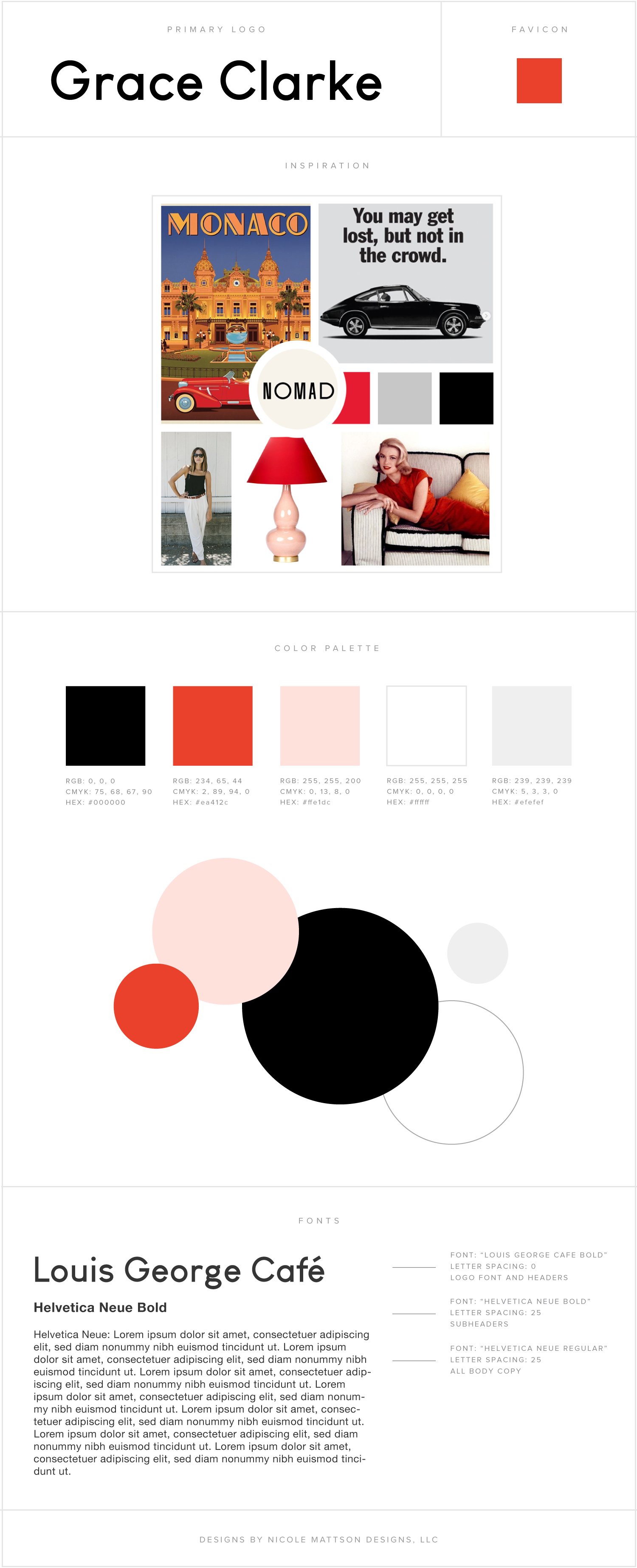
Mood Board
Custom Logo Design
Favicon
Color Palette Development
Font Pairings
Branded Elements for website
Branding Style Guide
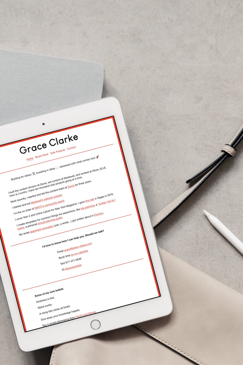
Squarespace Website Design
Custom Social Sharing Graphic
I absolutely adored working with Grace because of how engaged she was with the creative process and how thoughtful she was. Before we began, she had already put together several Pinterest boards to capture her unique aesthetic, but she was having a hard time translating that into tangible design. So it was the best feeling in the world to see how Grace would light up as I began to represent her style through a mission-aligned mood board and ultimately a full brand identity for her:
“I can't tell you how crazy and exciting and weird (in a good way!) it is to see my energy so perfectly and succinctly captured. It's funny - when I explain to clients and people who I think I am, I basically have a visual river running through my mind of everything you put together. Thank you for being so perceptive.”
The brand identity and website we created is bold and sleek with hints of quirkiness that mirror Grace’s personality. It utilizes playful pastiche design elements and is reminiscent of a more old-school layout while incorporating a new modern twist. Our primary colors are black, white, grey, and red with pops of a softer, complimentary rose color. Her website sets her apart and starts a conversation with the bold contrast between heavy black and red fonts and lines against open white space.
The design of this site is relatively simple and minimalistic. We’ve used clean sans-serif fonts, small type, and left-justified text to capture the no-nonsense and self-aware playfulness of her brand. Overall, her site is text-heavy by design so that when visitors land on her portfolio pages they are captivated by the large images that inspire further exploration into her work. The user experience is straightforward and to the point, but you’ll still come across these delightfully quirky features that take page visitors by surprise, such as the bold red color of the interactive hyperlinks and the site-wide border, playful emojis, and the vibrant block of color from her instagram feed.
It brought me so much joy to see how happy Grace was with her branding and her website. Check it out here to see what we did and to learn more about working with this creative genius!

Client Love!
“A few things Nicole did exceptionally well:
* helped drive 5 inbound leads in the last week alone because of her SEO skills
* saved me about 40 of what would've been my amateur efforts, allowing me to put that time into doing my *actual* work
* turned my vague descriptors of what I want my website to look like into three excellent directions for me to choose from
* led a very organized process; followed up when I slowed progress
* made my online presence reflect HOW I work and used small visual and UX cues to reflect what clients can expect working with me
Added benefit: Nicole is a joy to partner with. She's warm, excited about turning feedback into improvement, and she teaches you along the way. You will be better and smarter for working with her!”
— Grace Clarke

Want to learn more about working together?
Tell me a bit about your project and we can schedule your free 30 minute consultation!


